How to turn a folding carton into luxury packaging
24th August 2026
Read MoreBigger isn’t always better in structural packaging design. Instead the addition of small details can have a bigger impact on your packaging’s shelf presence. In this blog we’re going to share some recent packs that have subtle changes or additions that have elevated the packaging design.
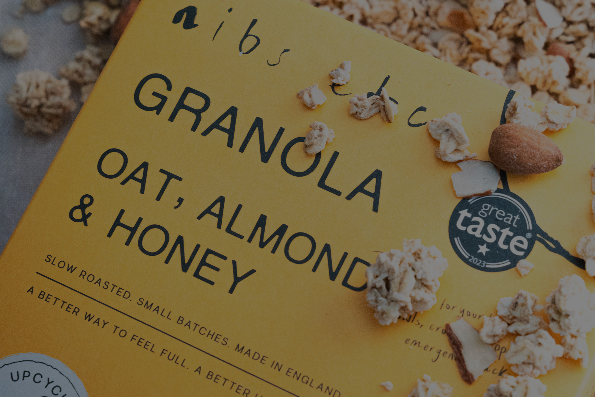
Last year nibs etc. entrusted us with their new packaging design. In the initial design, a generic shape was chosen for the aperture to reveal their slow roasted granola, but this time we lent into their graphic design. The hand drawn image of an apple dominates their packaging as they produce their granola with upcycled British apple pulp and now the aperture forms part of that apple design. Instead of a highlight to represent the shine of the apple you have the window to the granola, now a completely organic shape. Making more of the design and creating a difference for the shelf.
A recent pack we’ve produced was for brand Longbottom & Co for their Virgin Mary (a spiced tomato juice). It was elevated from a standard, print only can multi-pack with waves of spot gloss varnish. This subtle effect creates an iridescence that the light in store will pick up and will catch the eye of consumer. When paired with the perfect tomato red and iconic branding using Elizabeth I (famously known as the Virgin Queen) a pack that cannot be ignored is created.
Another pack that recently passed through our presses was for Reclaim. Again a multi-pack can packaging, this time it stands out through a simple flip of colours. They took their can design and inverted the colours for the outer pack. Making it instantly recognisable and different at the same time.
By choosing a gradient vignette to emulate “gold” but simply printed from CMYK, this elevated Mezcal Reina’s packaging design. It makes the whole design appear to shimmer without breaking the budget by adding metallic foil. Again making it stand out beautifully on shelf and tie with the brand’s luxury positioning.
Are you ready to level-up your packaging? Discover more small details that can have a big impact on your packaging design, by getting in touch.